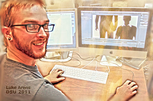
 Luke Arens
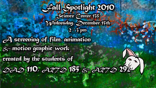
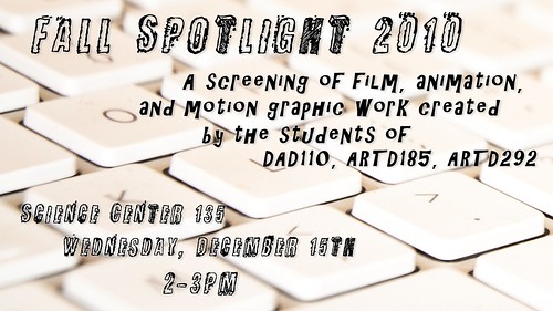
 created the winning postcard design for the Fall 2010, Animation Spotlight event.
Luke Arens is a 4th year Digital Art & Design major, with a Computer Graphics Specialization.
 Tell us about yourself
I started taking an interest in computer graphics and design early on in high school and by the time I graduated in 2005 I was fluent in Photoshop and started experimenting in Illustrator. Here at DSU I've just acquired a new love for animation and am learning to put principles and techniques I've picked up over the years into motion.
What did you like about this project to create a postcard design for Spotlight?
My semester has been filled with designing for animation so it was nice to take a break and create something that isn't moving. Though I think the design lends itself pretty well to being put in motion. Maybe I'll take that idea and run with it later...
What was your inspiration for the project?
At first it started out as a big block of text of different sizes at right angles that was super hard to read, but it obviously didn't work so I took a little soda break and cruised through some of my favorite design bookmarks. I found a Layer Tennis match that I had seen between some very talented designers that started off with a weird yet awesome mix of election/constructivist propaganda. I loved the color palette and the strong type so I tried to emulate that while keeping it simple yet eye-catching.
Here is what I'm talking about. It is definitely worth looking at if you are at all into graphics as an art form.
What did you learn from this project?
Readability is harder than you might think to achieve. Sure you might have a huge awesome font library, but that doesn't mean anything if you don't know how to use it. There is a time and a place for fancy swashes and busted up serifs, and it is the job of the designer to determine what to use and how to arrange an effective piece of design.
Thanks Luke !
Luke Arens on Tumblr
Luke Arens on YouTube
Luke Arens on Vimeo
Luke Arens on Flickr